Project 1 - Subway
CS 424 Project 1 Description - Kevin Elliott
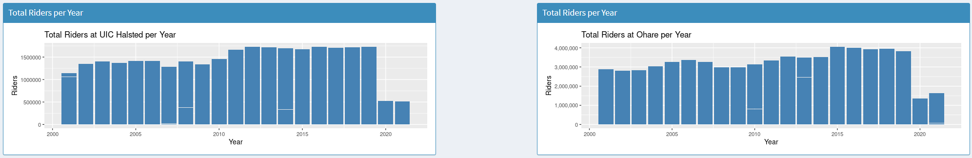
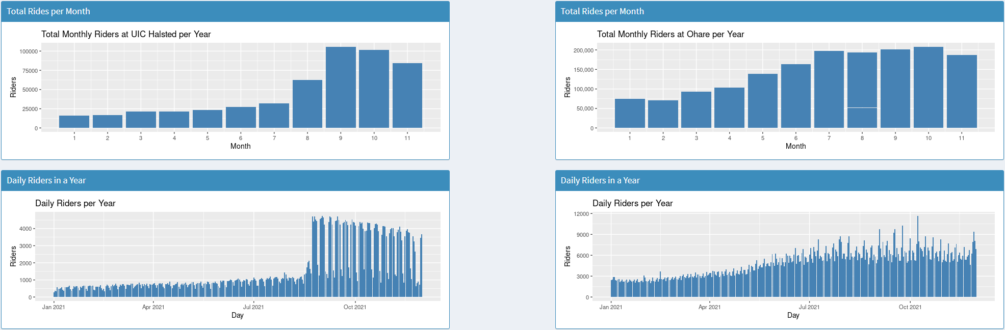
Project 1’s aim is to take data from the Chicago data portal on CTA train stops, and convert them into a visual representation of the data for the Halsted and O'hare stops on the blue line. The primary language used for this project is R, and it is hosted on shinyapps. When initially loading into the webpage, you will see two graphs placed left to right representing the total count of people who were riders at UIC Halsted, and O'hare respectively. The screen is divided into two sections, left and right, With all UIC halsted related data being on the left side, and O'hare on the right. To view different data graphs, access the toolbar on the left side of the screen. Here you will find an about page which includes a brief description of the project and the sources for data and starter code. After returning to the dashboard tab users can manipulate the data as they choose with the drop tabs. The first tab is the year to focus the data on, after selecting a year, if there are any relevant graphs that can change to focus just that year they will update. To add more graphs or tables to the screen, go to the relevant title of the drop tab and change the selection from off to graph, table, or both. There are 4 graphs and 4 tables that can be displayed for both stops, Total across Years, Total In Year, Daily In year, Monthly In Year. Total across years is the initial graph shown on startup which displays the total count of riders each year, from 2001 to 2021. Total in year shows the daily count of riders in the year selected by the user. Daily in year shows the count of riders on each weekday Monday through Sunday over the whole year. Monthly in Year shows the total count of riders for each month of the users given year. Along with these four graphs, each can also be represented as a table where the total numbers are displayed alongside the relevant day, weekday, or month so getting the exact numbers is easier. Besides the displaying of the data this app can be used to see when certain events happen like online classes starting or a parade happening downtown. Large spikes in users are common around big events and seeing the graphs daily count makes it easier to located when these happened. The layout of this app also allows for users to make quick comparisons between the two stops of O'hare and UIC Halsted. Immediately there are some large differences between the two such as user count, 1.5 Million people a year for Halsted where as O’hare has 3 to 4 million users. As you look further into the graphs and tables you’ll notice that even though the two share a train line, they are very different in user count, busy days, shutdowns, activity and more. Image below: Total Monthly and Daily Rider Count for 2021
CS 424 Project 1 Data Used - The data used in this project is from the Chicago data portal under the name ‘CTA - Ridership - ‘L’ Station Entries - Daily Totals’ and was last updated January 28th 2022. Initially the data contains five columns, station id, station name, date, daytype and rides. Since the project is hosted on the shinyapps site, I had to trim the total data down to under 5MB per file. Therefore my first change to the source data was to get rid of any data that was not relevant to the project. The focus was on the stop UIC Halsted, and O’hare airport so these were the only two stops I was interested in keeping. First off I imported the csv file into R studio so I can manipulate it easier, then I stored the csv data in a dataframe for more options on storage. Then I created a new dataframe and used the split function to store the data from the entire list of data only if it matched the station id of UIC halsted. Once the data was properly separated, using the ‘write.csv’ command converts the data frame into a new csv file which after separation was 440kb, much less than the 5MB limit. Now that the data had been properly divided, some changes were made for easier access to the properties of the columns. The lubridate library was applied to the date column so that if needed, just a single aspect of the date such as month or year could be returned. Then multiple columns were added such as month number, year number, and day number. These were added for readability and simplicity in graphing functions, as many of the graphs relied on these particular data points and not the entire date. Besides the initial data changes, I also used a function to grab the year the user has selected from the drop tab, and then separate the data into a smaller section. Whenever a user changes the year on the GUI, a subset of the data is created where the only data that is returned is the lines that have the matching year number as the users choice, this allowed for on the fly changes of graphs without needing to create and load csv files for each individual year and then have functions for creating graphs of each year. Once the dataset was properly prepared, I was able to start graphing. Preparing was an essential part of the project as nearly every graph created could not function based on the initial state of the file. Even though the date was included, it was not in a readable format for R so it was inaccessible. Creating a month and day number column made creating their respective graphs easier and much more readable. For example the line (x= month Number, y= rides) makes for a much more readable graph function over calling multiple functions to extract the same data. Without proper preparation of the data the project would have been incredibly difficult and impossible to host on the shiny app servers, it was an essential part of the project. Image below: Total weekday rider count 2021
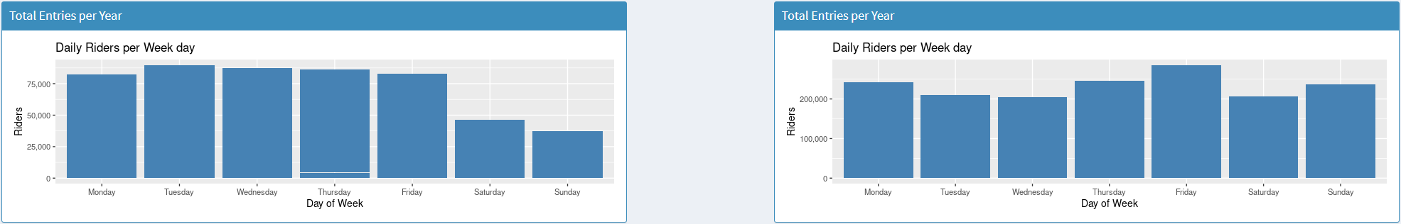
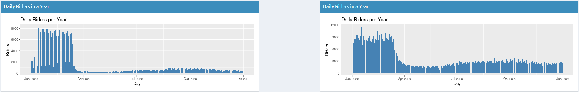
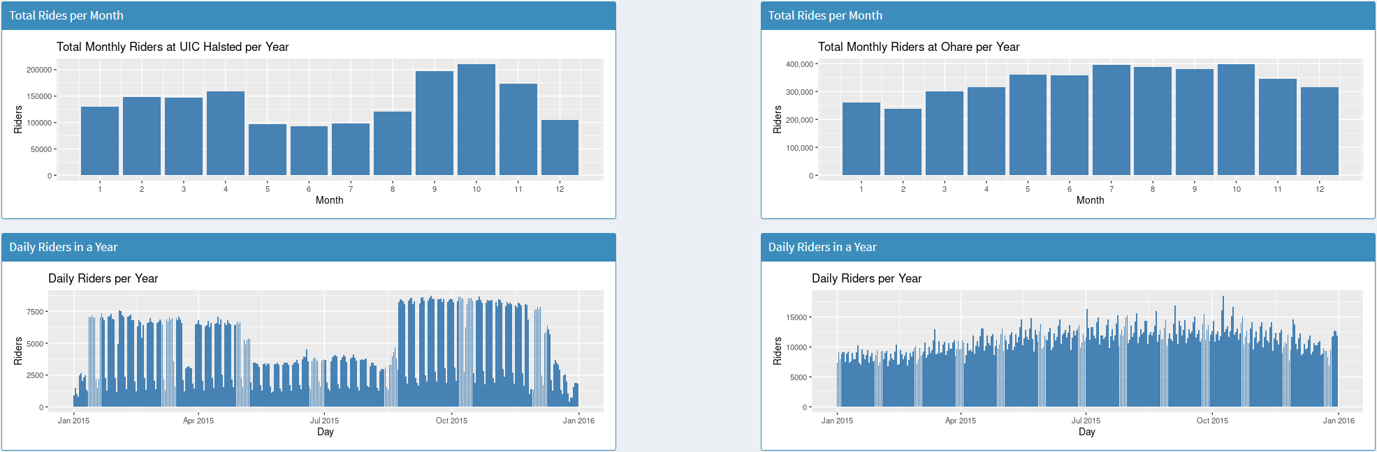
CS 424 Project 1 Interesting Data Points - After creating these data visualizations many interesting points can be located throughout the years and years of graphs. Initially I noticed the massive differences in riders between UIC Halsted and O’hare. UIC Halsted peaks at around 1.75 million yearly riders and has a low of 500 thousand riders, whereas O'hare has a peak of 4 Million riders and a low of 1.3 million riders. This massive difference makes sense given the fact that O’hare is an international airport, but it's still interesting to see just how vastly different the sample size is. Another data point I focused on was based around the UIC academic year, particularly fall and spring semesters. Both UIC and O'hare experienced an increase in ridership at the end of 2021 compared to the beginning but each had different growth rates. UIC had around 1,000 daily riders all throughout the year until in August where it shot up to around 4,000 average and slowly dropped to 3500 by the end of the year. This clearly aligns with the spring semester at UIC being online and the fall semester being in person, causing many students to take the train to class. O’hare on the other hand had a steady growth from 3,000 daily riders to 5-7,000 by the end of the year. Besides daily rides there is also the weekday travel data for each stop, UIC has the vast majority of its entries Monday through Friday with none of the days being a clear peak in entries. Weekends however accounted for far less, Sunday had less than half of the riders that any given weekday had and Saturday was not much higher with around 10% more. Looking at the two stops in relation to covid 19 also gives insight as to how it was handled at each stop. In January and February of 2020 daily riders at UIC were around 7,000 and 8,000 for O’hare, which is interesting because at that moment the two were pretty close in daily data. Both of them also experience a massive drop around April but the major difference is how far and steep that drop was. UIC Halsted immediately goes down to under 500 per day whereas O’hare over the course of a few weeks drops to about 1,500 and eventually climbs up to 3,000. The service that O’hare provides means that some people still need to be there and get on flights whereas most avoid flying for the time being. UIC can just move to online classes and suddenly no one needs to get on the train to get there and everything still functions despite the policy change. Looking back further to 2015 there are some trends that only appear at the UIC side and not O’hare. There are multiple dips in the daily rides per year graph that line up with May-Aug, December-January and a single week in March, which also perfectly aligns with the breaks in semesters and spring break for UIC. It's interesting to see just how much you can figure out about UIC and O’hare just by analyzing the CTA traffic of the stop attached to them. Images below: 1st: daily riders in 2020 2nd: Daily riders and monthly riders for 2015
To try the project out yourself check out the github repository then install R, along with Rstudio and Shiny after all is installed, import this project as a shiny app