Student Choice - Airbnb in Sydney
CS 424 Student Choice - Kevin Elliott
The students choice project analyzes an online visualization and creates a critical discussion around the design and functionality of the visualization
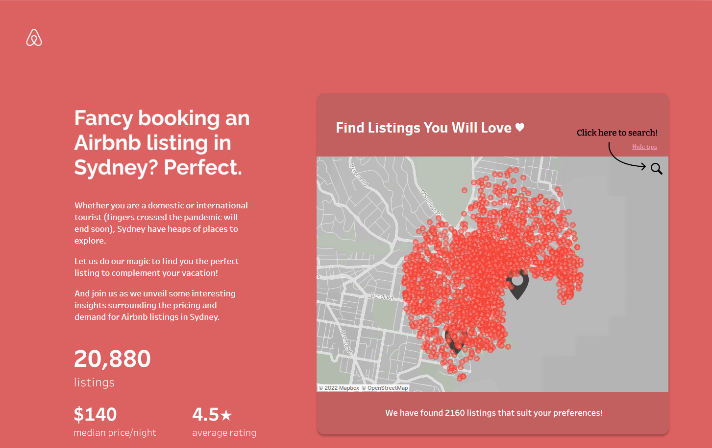
What is the purpose of the visualization - The purpose of this visualization is to compare the many airbnb locations across the city of Sydney to certain surrounding variables such as distance to nearest train station, distance to nearest tourist attractions, number of bedrooms, ratings and total people accommodated. Besides the airbnb descriptors there is also a visualization of the individual neighborhoods and areas of Sydney and how where an airbnb is located affects its price. There is also data on how the pandemic has affected Sydney's airbnb market. In total, the purpose of this visualization is to provide the user with the tools to analyze the Sydney airbnb market and how it has changed since the pandemic.
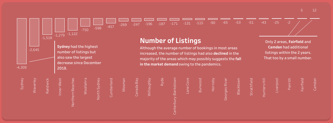
What is the Data - The data is the listings posted to airbnb in Sydney, and each lists supplemental data such as price, distance to attractions/trains, number of bedrooms/guests. Other data that is not directly related to single listings are average pricing history for areas of the city, average pricing history per guest, and number of listings in an area
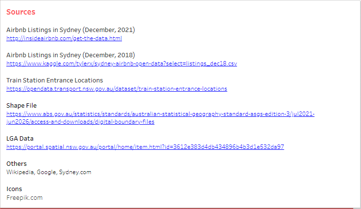
How was the data collected - data was collected from multiple sources as listed at the bottom of the visualization, the listings were collected from insiderairbnb.com, combined with kaggle.com data about sydney listings in particular. For the public transportation data it was taken the the australian government data portal opendata.transport.nsw.gov.au, and the suburbs and areas of the city were taken from the portal as well.
Who are the users that this visualization was made for - This visualization could be for tourists who want to see more about their options in Sydney while they plan a trip, or it could be for someone who wants to host an airbnb but does not know the market well. Of course it's also made for anyone who is interested in data visualizations as said by the author herself, since she doesn’t fit into either of the first two categories.
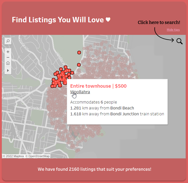
What questions do people want to ask - Some questions that people that want to buy an airbnb for a weekend or so ask are, how much will it be per night, how far is it from the beach or city, where is it in the neighborhood, is it a good deal compared to others, do they have time to wait on a decision or does it sell fast. Someone who is renting out an airbnb would want to know if they are in a common area to rent, how much similar listing go for, how far they are from attractions, how often people rent and if charging per person or in total changes things.
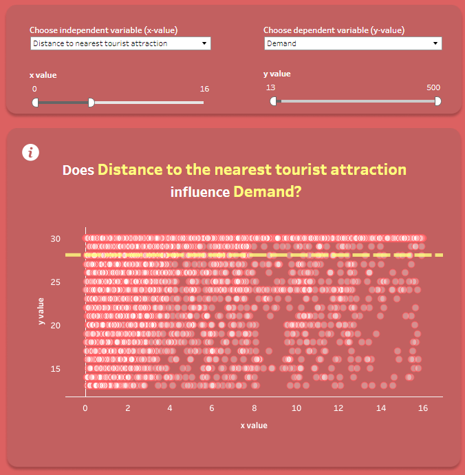
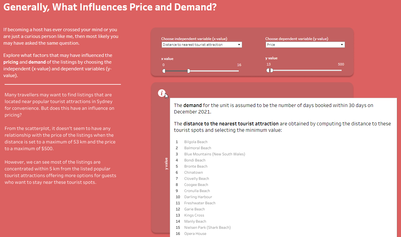
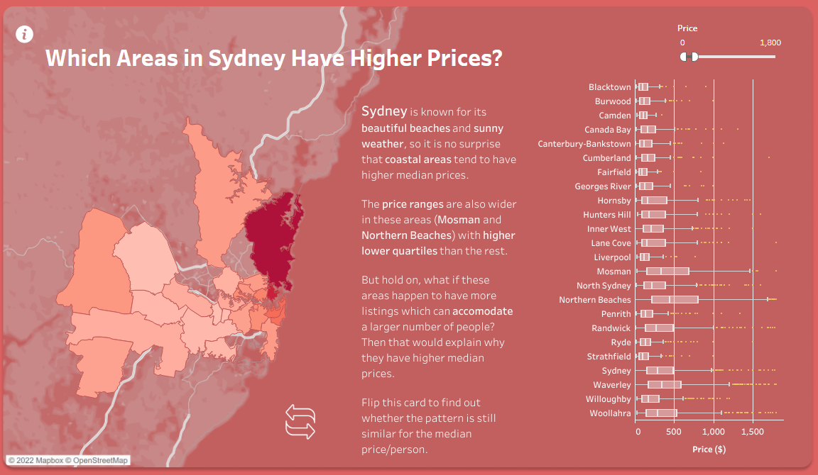
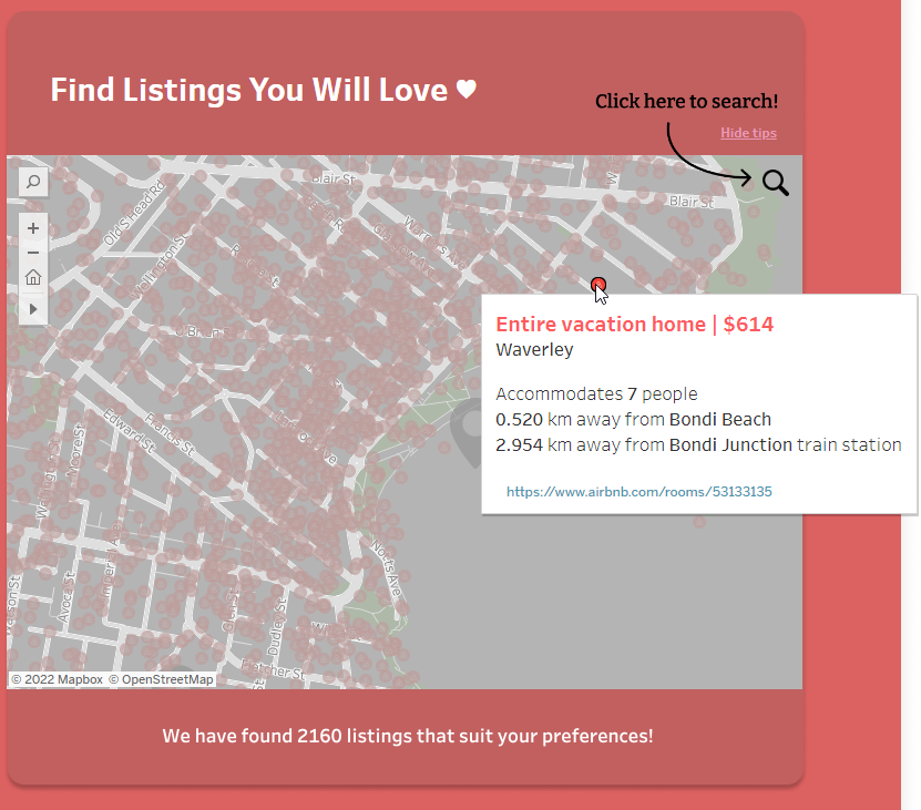
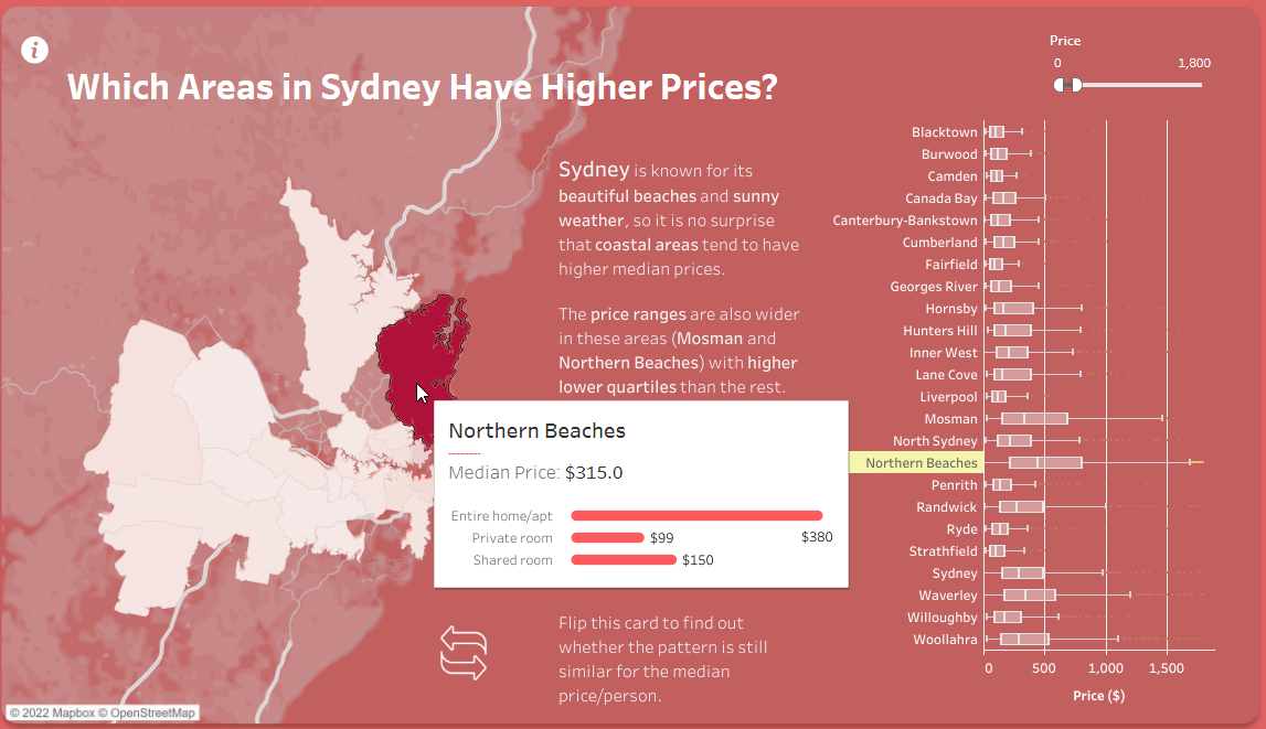
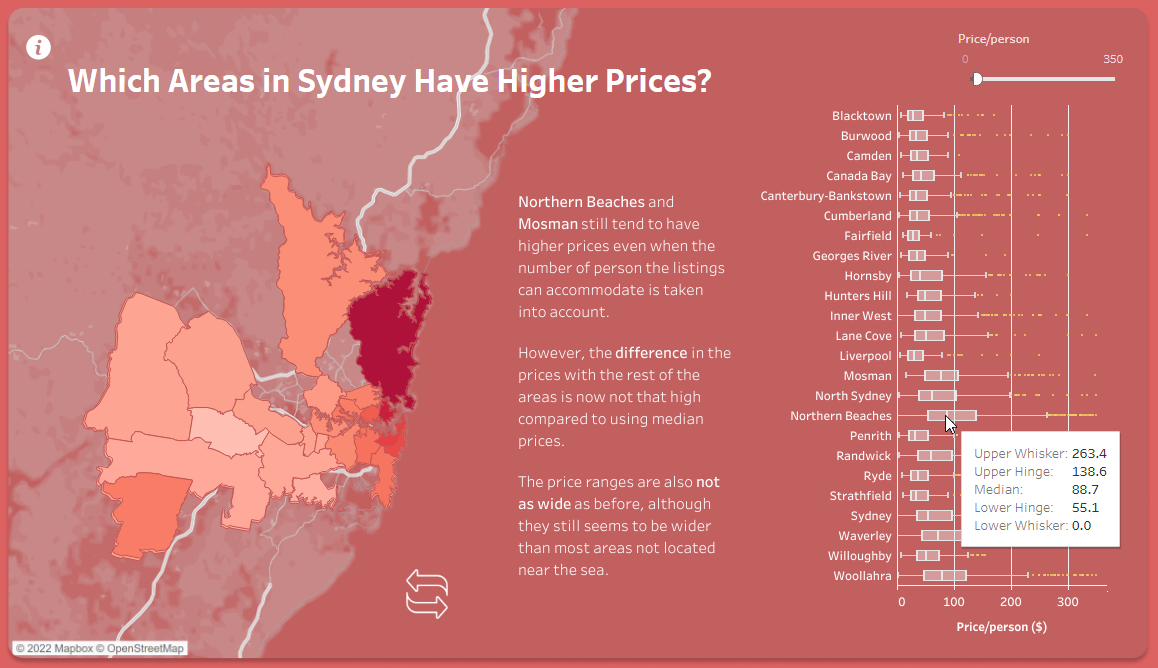
How can they find answers with this tool - Most of these questions have direct answers from the visualization, questions about pricing for certain areas can be found in the second map where hovering over a part of the city shows the median price, along with medians of an entire house or a private room. Finding distances can be found in the first map by hovering over a listing, which then shows distance to a nearby attraction (commonly a beach) and then distance to the nearest train station. To show if it's a good deal compared to others, you can use the graphing section and apply pricing/distance filters to fit what you are looking for, this yields the listings that are similar all together so comparing is much easier than one by one on a map. Using the Demand filter on the graph also shows how many days in a month the place is booked for. Pressing the flip button on the second map shows how listings change when showing total unit prices compared to single private room prices, which could be insightful to someone wanting to rent their place and needing to decide on what method to rent as.
What works -
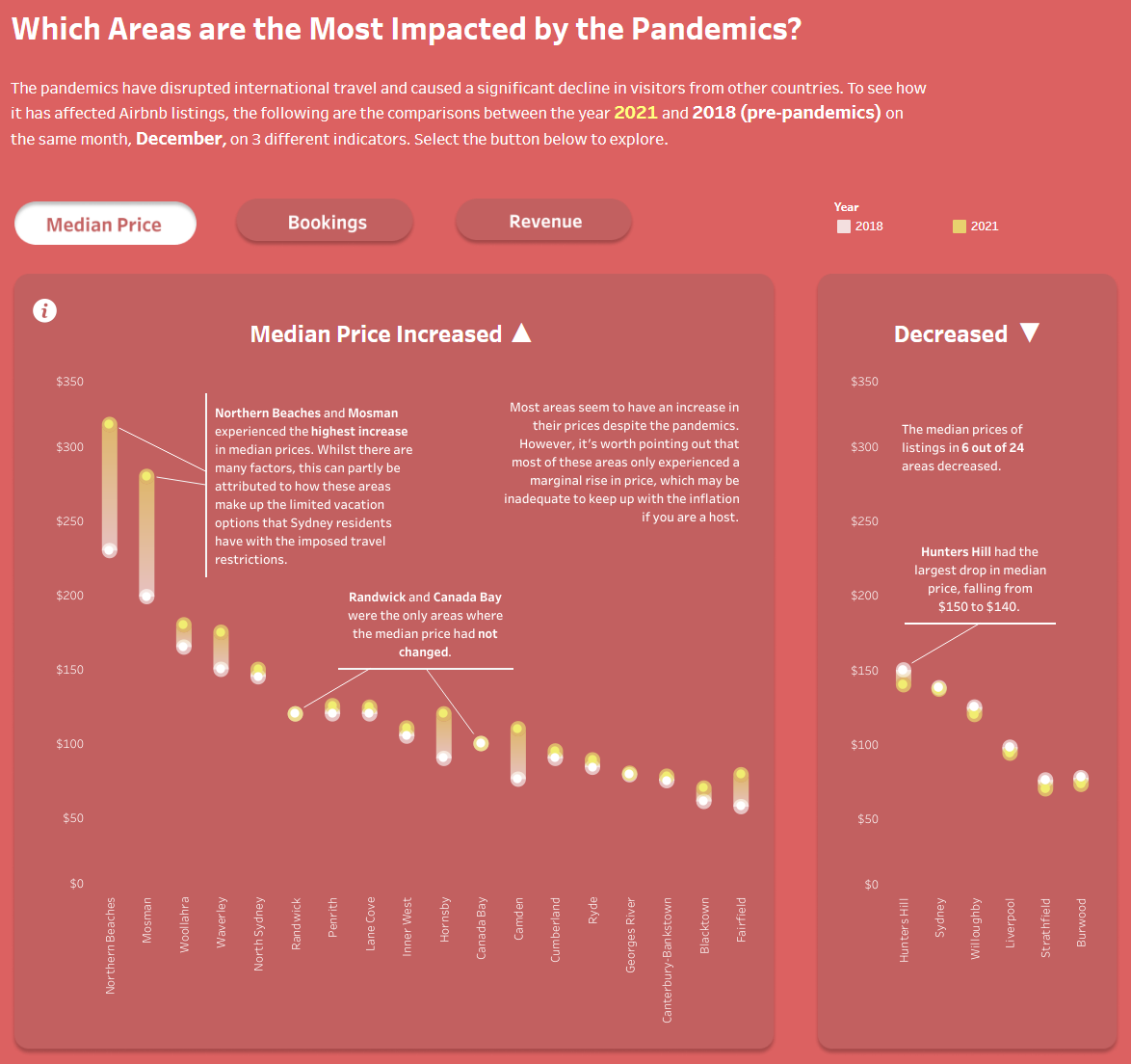
The two maps are certainly the highlight of the project, they have a clear function that is instantly recognisable. Neither overlap with each other on what they do either, with the first showing all the listings in the city and their individual stats, while the second covers the general trends of the areas and neighborhoods. Each map also has a level of interactivity that allows for more information to be displayed on demand, without cluttering the interface. Color and data density flows from low->light to high->dark, and the gradient used doesn’t create any uncertainties from an initial glance. When it comes to plotting the airbnb listings on the map, each is given the same size and color since just a listing existing is what is being looked at instead of price or distances. Besides the maps, the graphs at the bottom of the page are great for showing the history of the listings, showing changes in data clearly and also providing explanations to the more notable data points. These graphs stay consistent in scale, colors, axis and labels throughout, making it easy to follow and extract information from. Having created a map visualization in project 2, it’s clear to see that there was a lot of effort in the second one to layout the parts of the city and provide data to each one. Another part that works really well in the first map is the data that comes with clicking on a node, providing the distances to attractions, takes calculations for each node and the link to the listing itself is a nice touch. Clicking on the region in the node description also highlights all the others that are in the area. These features are ones that may not be used too often but after creating a project that uses the map I can tell that there was a lot of effort put into making the map have useful features while not creating clutter.
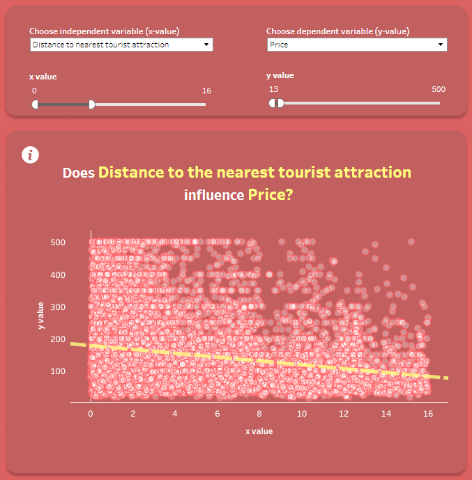
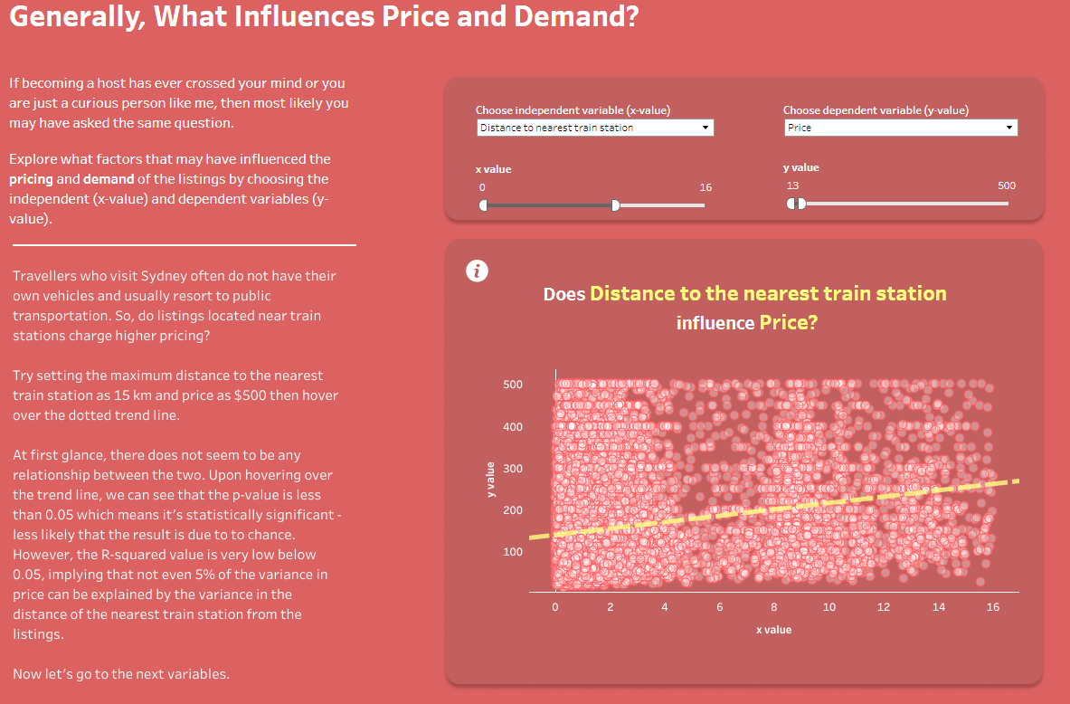
What needs improvement - One part of the visualization that lacks clarity is the first graph which lets the user change the x and y axis to distance to beach vs price and so on. This visualization is very useful when looking at overall trends but that starts to break down a bit once someone wants to know more details than that. For example setting the x value to ‘Distance to nearest tourist attraction’ and y value to ‘price’ it's easy to notice the general trends, that the majority of listings are under $200 and as the distance gets closer to 0 that price gets closer to $200. However drawing the conclusion of the majority is about all you could reasonably come to since the concentration of points overlap so heavily that it's very hard to tell the difference between a high concentration vs a medium one. One possible remedy to this could be more space for the graph, as the page is set up there is room to expand without interrupting the flow, perhaps something similar to the graphs on the bottom of the page. Another aspect of the visualization that could use improvement is the use of the ‘i’ icon, some pretty key information to understanding the graphs is placed there which could certainly be more prominent on the page. For example the description of ‘demand’ is found in the popup for the first graph, showing the description of ‘days booked in a 30 day timeframe’. This might not be something that is initially what demand is assumed to mean by a user and could instead be placed in the graph description section with the other information on how to use it.